Welcome to the Analyse section, dedicated to furnishing you with the necessary guidance and tools to make sense of the collected data.

Here, our aim is to empower you to identify trends, seize learning opportunities, and pinpoint areas for improvement within your dataset. By providing insights into interpreting the data, we’re here to assist you in unlocking its potential to recognise patterns, grasp learning prospects, and strategically enhance various aspects of your efforts.
-
HACT Social Value Bank
The HACT Social Value Bank is designed to measure the positive impact of small organisations (turnover less than £350,000 last financial year).
Before you start using this tool, you should refer to the related Guide (Measuring the Social Impact of Community Investment: A Guide to using the Wellbeing Valuation Approach) and support materials. The Guide provides an introduction to the approach, and the supporting materials are an update to this. These are available here.
-
Accessing Open-Source Data
Data can play a crucial role in understanding the people and places we work with, as well as highlighting the ‘need’ and importance of our work. Accessing open-source datasets can serve as a valuable resource to gather information that demonstrates the necessity of our work to funders.
Below provides some key platforms for accessing open-source datasets:
- Gov.uk – provides access to various datasets from different government departments. Relevant datasets that can be sourced through Gov.uk, including Indices of Deprivation, Children in Low Income Families Area Statistics and data relating to schools, pupils, and their characteristics (including free school meal data). Some of these datasets are available on Stat-Xplore, which is a tool that can used to create your own data tables and analysis. A Stat-Xplore guide can be found here: User Guide (dwp.gov.uk)
- Public Health dashboard and map tool – The purpose of the public health dashboard is to support local decision making by bringing existing comparative data into one place and making it accessible and meaningful. The dashboard currently provides summary data on, best start in life, child obesity, drug treatment, alcohol treatment, NHS Health Checks, Sexual health services, Tobacco control and air quality. For each theme, there is one combined (summary rank) indicator made up of several different component indicators. Based on this, each local authority in each of the service areas has been given a ranking and category description about how local delivery compares with all other local authorities and on a like-for-like basis.
- Census Data Maps – The census takes place every 10 years. It gives us a picture of all the people and households in England and Wales. The Census map tool allows you to explore a range of topics such as population, education, identity, housing, health and work.
- Sport England data page – Offers a variety of reports and interactive tools designed to help you explore data related to physical activity. On their data page, you’ll find two main sections: ‘data about people’ and ‘data about places’. The ‘data about people’ section allows you to explore the results of the Active Lives survey. In the ‘data about places’ section, you can access data concerning sports facilities in your local area. Additionally, Sport England provides other helpful interactive tools like the ‘Local Area Insights’ and the ‘market segmentation tool.’ These tools are specifically designed to offer information and support for grant applications, advocacy, or to help you understand the people and places you work with.
- Sport Wales Research and Insight page – offers a range of reports and datasets relating to sport and physical activity in Wales, in particular the School Sport Survey and the Sport and Active Lifestyles Survey – which provides the sector with a clear picture of progress and the work that is required in enabling sport in Wales to thrive.
- Social Mobility Commission – The social mobility commission state of the nation report looks at full mobility outcomes, intermediate (early-life) outcomes, and drivers, with breakdowns by geography and personal characteristics. In September the State of the Nation 2023 report is being released, along with a new Data Explorer tool. Particularly relevant are the ‘drivers’ of social mobility i.e., children and young people, there is a segment of measures around childhood poverty. It does appear the tool will display data at regional level.
- Joseph Rowntree Foundation (JRF) – JRF are an independent social change organisation, that conducts research on poverty in the UK. The data presented in the link below is from their 2023 UK Poverty report, setting out the trends and impacts of poverty across the UK.
-
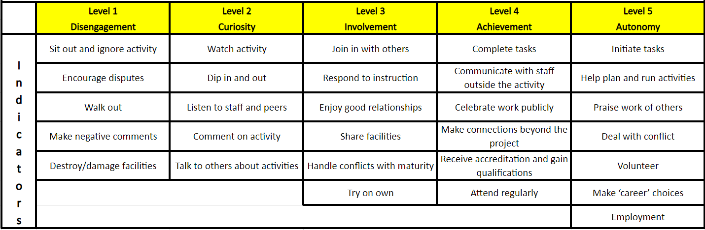
Engagement Ladder
The engagement ladder is a useful tool that helps quantify participant levels of engagement, using a scale of 1 to 5.
It works on the basis of a coaching updating a participant’s engagement at least twice, ideally once at the initiation of the programme or arrival of the participant, then at intervals until the end of the programme, or departure of the participant.
The table provides indicators to show where a participant may be at different stages of their involvement. (It may be useful to refer to this before, during or just after sessions, to help identify participant progression/digression easily while memory is fresh). The 5 categories can also be added to the ‘Engagement’ section of Views accounts, should an LTO wish to record this in their account along with their attendance data.
The engagement ladder is a great way to help provide a well-rounded evaluation of your sessions, especially when combined with robust attendance data. This tool has been used in several StreetGames interventions, particularly in ‘Safer’ strands of work with individuals that are typically harder to engage.
-
Mapping
Interactive maps can be a highly effective method of demonstrating the impact of our work. A number of tools can be used to develop data visualisations on maps, which can help demonstrate impact to funders and show visual representation of your delivery. Below provides an introduction to help you create your own Google My Maps, as well as some links that provide further information.
At StreetGames we also have access to mapping/dashboard software which allows more advanced visualisation and multiple layers. We will look to implement mapping throughout various interventions to support an evidence base, highlighting need for investment and could also be used in the evaluation stage of an intervention, to demonstrate impact.
Free Mapping Tools and Guidance:
-
Excel
At StreetGames, we would always recommend using a safe and secure monitoring system, such as Views or Upshot to record your participant and attendance data. However in some cases, you may have to record this data in Excel, or perhaps you have exported this data into Excel from a monitoring system, to perform analysis.
If you have collected data via an online survey, depending on what platform and level of paid/free account you have used, you may need to export the responses to Excel, to be able to analyse the data.
Excel can be a great tool for analysing data, especially if you know all the ‘tricks’ which are commonly done by using a ‘formula’. Here are a few, that our Research & Insight team would regularly put to use when ‘cleaning’ and formatting data for analysis.
- Conditional Formatting
- SUM
- AutoFilters
- Pivot Tables
- COUNTIF Formula
- VLOOKUP Formula
An extensive guide to all of these tools and more, can be found in the links to the right, and a full YouTube tutorial below courtesy of Datawise London: watch here.